Swipe Bait: The Sensory Science Apps Use to Turn Five Minutes Into Two Hours
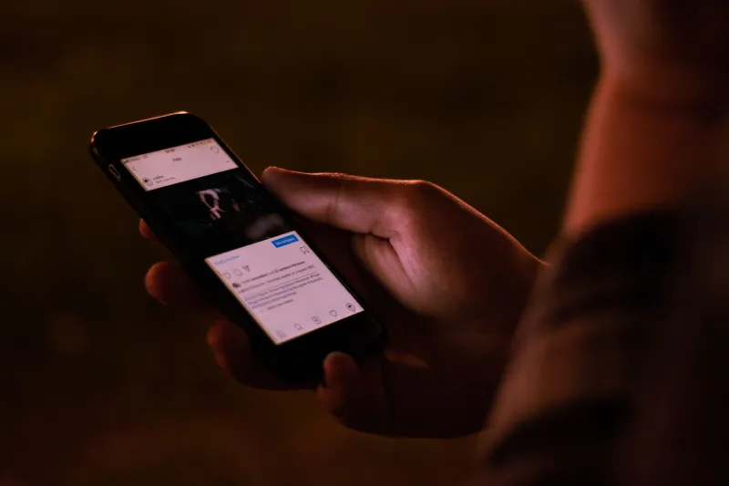
You open Instagram to check one thing. Forty-five minutes later, you're watching a stranger's travel reel from 2019 and you genuinely cannot explain how you got there. Sound familiar? That's not a personal failure. That's engineering.
The apps living on your phone aren't just software — they're sensory environments, carefully constructed to feel irresistible. Color, sound, movement, timing: every element has been tested, tweaked, and optimized not for your enjoyment, but for your retention. And once you understand what's actually happening, you can't unsee it.
Your Brain on a Notification
Let's start with the basics. The human brain runs on dopamine — a neurotransmitter tied to anticipation, reward, and motivation. Here's the key word: anticipation. Dopamine doesn't just fire when something good happens. It fires hardest when you're not sure whether something good is about to happen.
Slot machines figured this out decades ago. Variable reward schedules — where you get a payoff sometimes, but not always, and never on a predictable timeline — are the most powerful behavior-reinforcing mechanism we know of. Pulling to refresh your feed is, neurologically speaking, pulling a lever. You might get something great. You might get nothing. You keep pulling.
App designers know this. They've known it for years. And they've built entire sensory systems around exploiting it.
The Color of Urgency
Take a look at your phone's notification badges. Almost universally, they're red. That's not a coincidence or a legacy design choice nobody bothered to update. Red is the color of urgency, danger, and — critically — unfinished business. Research in color psychology consistently links red to heightened arousal and attention. When your brain sees that little red dot, it registers something that needs to be addressed. The discomfort of leaving it there is low-key real.
Instagram's original icon was a warm, retro brown-and-yellow camera. When they rebranded to that now-iconic gradient — hot pink bleeding into orange and purple — engagement metrics reportedly climbed. The gradient is vibrant, alive, and slightly overwhelming in a way that flat design isn't. It demands a look.
TikTok goes further. Its interface is almost aggressively high-contrast: black backgrounds, white text, and video content that's lit and color-graded to pop on a small screen. The darkness around the content acts like a spotlight. Your visual focus narrows. The outside world softens. You're in the app now.
Sound as a Hook
The audio layer of these platforms is just as deliberate as the visuals, and somehow we talk about it way less.
TikTok's default notification sound — that short, bright chime — sits in a frequency range that human ears are specifically wired to notice. It's not harsh, but it's impossible to tune out. The app also leans into in-content audio in a way no other platform has matched. Because sound autoplays the moment a video appears, you're pulled into the content before you've consciously decided to watch it. The hook lands before your rational brain can object.
Instagram's direct message notification is softer, more intimate — almost like a whisper. That's intentional. It signals personal connection rather than broadcast content. Your nervous system reads it differently than a retweet notification. It feels like someone specifically reached out to you.
Even the absence of sound is a design choice. The satisfying thunk of a like registering, the subtle haptic buzz when someone follows you — these micro-sensations are calibrated to feel like small physical rewards. Your body responds before your mind does.
Motion That Won't Let You Rest
Static content doesn't hold attention the way movement does. That's just human neurology — our peripheral vision evolved to detect motion because motion meant either predator or prey. Apps have essentially hacked that survival instinct for content consumption.
TikTok's full-screen, autoplay, infinite scroll format is the most aggressive version of this. There's no natural stopping point. The next video begins before you've finished processing the last one. The speed of transitions is tuned so that pausing to exit feels like more effort than just... watching one more.
Instagram Stories introduced a progress bar — a thin line at the top of the screen that depletes as each story plays. That little bar creates a completion compulsion. You're so close to the end of this one. And then the next profile's stories start automatically. The treadmill never stops.
Reels and TikTok videos are also increasingly front-loaded with visual movement in the first half-second specifically to prevent the scroll. Creators have learned — and platform algorithms reward — content that grabs visually before a single word is spoken or read.
Emerging Platforms Are Turning It Up
If you think TikTok and Instagram are intense, the newer generation of apps is pushing even further. BeReal built its entire identity around the anti-dopamine design, but that scarcity and authenticity became its own form of compulsion — the random notification that tells you it's time to post creates anxiety-driven engagement rather than pleasure-driven engagement. Different mechanism, same trap.
Platforms experimenting with AI-generated feeds — where the content is assembled in real time based on your micro-behaviors — are removing even the thin illusion that you're browsing a timeline. You're not. You're inside a system that is constantly recalibrating to find the exact sensory combination that keeps your thumb still.
What You Can Actually Do With This Information
Knowing the playbook doesn't automatically free you from it. You can understand every technique in a magic trick and still gasp when it works. But awareness does give you something: a moment of pause between the stimulus and the response.
Some people find it helpful to switch apps to grayscale mode — removing the color reward from the equation makes feeds feel noticeably less compelling. Others set app timers, not to hit a hard limit, but to create a moment of conscious decision-making when the timer goes off. Do you actually want to keep going, or were you just on autopilot?
The deeper shift is recognizing that your attention is a resource that has genuine value — and that there are entire teams of very smart, very well-funded people whose job is to extract as much of it as possible. You're not weak for getting caught in the scroll. You're human, and these systems are built specifically for humans.
But every now and then, it's worth putting the phone down and noticing what the world looks like when nobody's engineered it for your engagement. Turns out it's pretty vivid on its own.