This Movie Feels Like Dusty Lavender: How Gen Z Turned Color Into the New Film Language

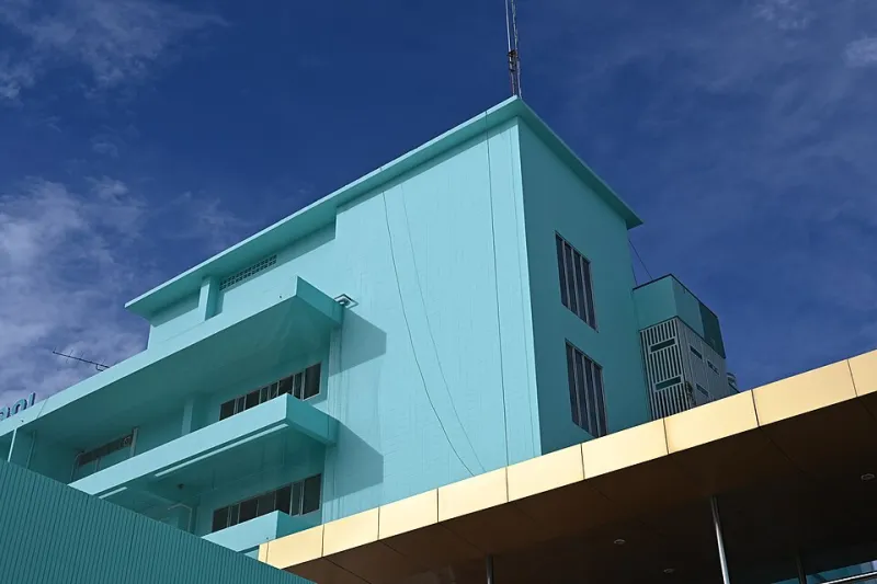
Photo by Photo by Igor Hnes on Unsplash on Unsplash
Ask a 22-year-old what their favorite movie is, and there's a decent chance they won't lead with the plot. They might say something like, "It's very muted green and early morning fog," or "That show gives me burnt orange energy — you know, like late October." If that sounds like a foreign language, you're probably not spending enough time on Film TikTok.
This is the synesthesia effect — and whether or not you've heard the clinical term, you've almost certainly felt it. It's the way Eternal Sunshine of the Spotless Mind lives in your memory as a specific shade of washed-out blue. The reason Euphoria feels neon and electric even when you're just thinking about it. The gut instinct that Midsommar is a blinding, wrong kind of yellow. Gen Z didn't invent this sensation, but they've turned it into a full cultural vocabulary — and it's reshaping how entertainment gets discovered, discussed, and loved.
When Feelings Become Colors
Synesthesia, technically speaking, is a neurological phenomenon where stimulation of one sense automatically triggers another — some people hear music and see colors, others taste shapes. True synesthesia affects a relatively small percentage of the population. But researchers have long noted that most humans experience a milder, learned version of cross-sensory association, especially when it comes to color and emotion.
Dr. Aria Mehta, a cognitive neuroscientist who studies sensory perception and media consumption, puts it plainly: "Color carries emotional memory in a way that plot summaries just don't. When someone says a film 'feels green,' they're communicating atmosphere, pacing, emotional temperature — things that are really hard to describe in words but instantly understood through color."
That efficiency is a big deal in a world where attention is currency. A thirty-second TikTok can convey the entire vibe of a three-season show through a color palette grid and the right audio. No spoilers. No lengthy synopsis. Just: this is what it feels like to exist inside this story.
The TikTok Pipeline
The trend exploded on TikTok somewhere around 2022, when creators started posting what they called "color palettes" for films — grids of hex codes or paint swatches paired with movie stills, all set to ambient or lo-fi audio. The format was almost meditative. Viewers weren't being sold on a movie so much as being invited to feel it before they'd even pressed play.
Creators like @cinematicpalettes and @huereviews (both with followings well into the hundreds of thousands) built entire channels around this concept. Their content rarely includes traditional criticism — no discussion of acting performances or screenplay structure. Instead, they'll describe a film as "dusty rose and overcast sky" or "that specific green of old library books" and somehow, their audiences know exactly what they mean.
"I started doing color posts because I couldn't explain why I loved certain movies more than others," says Maya, a 24-year-old creator based in Portland who runs a film color account with over 300K followers. "Like, I could tell you the story of Lost in Translation but that doesn't capture why it hits. Saying it feels like a pale, jet-lagged yellow at 3 a.m. — that gets closer to the truth."
Her most viral video? A side-by-side comparison of two beloved coming-of-age films — one described as "golden hour and worn denim," the other as "fluorescent lights and new sneakers." It racked up 4 million views. The comments were full of people tagging friends with nothing but a paint chip emoji.
Hollywood Is Paying Attention
This isn't just an internet quirk. Studios and streaming platforms have quietly started leaning into color as a marketing tool, understanding that the sensory impression a film leaves can drive discovery just as effectively as a trailer.
Marketing campaigns for prestige projects increasingly use desaturated, carefully curated color palettes in their social assets — not to show what the film looks like, but to signal how it feels. A24, the indie studio behind films like Hereditary, Everything Everywhere All at Once, and Past Lives, has practically built a brand identity around this. Ask a film-literate Gen Z viewer what "A24 colors" look like and they'll describe something specific: muted, slightly off, naturalistic, emotionally unsettling in a beautiful way.
"Cinematography has always been about emotional color grading," says film critic and writer James Okafor, who covers independent cinema for several publications. "What's new is that audiences are now consciously articulating what cinematographers have been doing instinctively for decades. Gen Z has essentially reverse-engineered the visual grammar of film and turned it into a social language."
Why This Changes the Recommendation Game
Traditional recommendation systems — think Netflix's algorithm or Letterboxd's genre tags — work on surface-level similarities. If you liked a thriller, here's another thriller. But color-coded, sensory-based recommendations operate on a different axis entirely. They group films by emotional texture rather than narrative structure.
This means a slow-burn Danish drama and a quiet American indie might get filed under the same "gray morning light, unspoken grief" category, even though one is subtitled foreign-language cinema and the other is a mainstream release. For audiences who are less concerned with genre labels and more focused on how a story makes them feel, this is a genuinely more useful system.
Apps and communities are starting to catch on. Some Letterboxd users have begun tagging reviews with color descriptors alongside traditional ratings. Discord servers dedicated to film recommendation have entire channels organized around mood palettes rather than genres. The community is essentially building an emotional index of cinema from the ground up.
More Than Aesthetics
It'd be easy to dismiss this as another Gen Z aesthetic trend — pretty, surface-level, more concerned with vibes than substance. But there's something genuinely interesting happening underneath the mood boards.
Describing art through sensory language is an act of translation. It takes something ineffable — the specific feeling of watching a particular film at a particular moment in your life — and tries to make it communicable. Color becomes a shorthand for the full emotional weight of an experience. "Warm amber and slow Sundays" isn't just pretty language; it's a compressed emotional biography of what a show meant to someone.
In an era of content overload, where there is genuinely more to watch than any human could consume in multiple lifetimes, this kind of shorthand matters. It helps people find not just good content, but content that's right for them, right now.
The Takeaway
The synesthesia effect is proof that audiences aren't passive. They're actively developing new tools to process, categorize, and share their relationship with entertainment — and color has emerged as one of the most intuitive tools available. Whether you're a film nerd deep in the Letterboxd trenches or someone who just wants to know if a show matches your current mood, the color conversation is one worth joining.
Next time someone tells you a movie feels like "overcast blue and old wool sweaters," don't ask them what it's about. Just ask where you can watch it.