What Your Go-To Color Is Secretly Telling the World About You
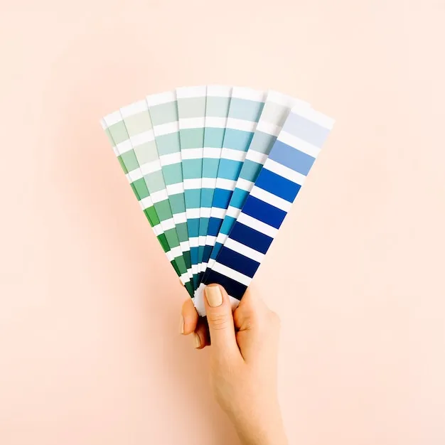
Photo: colorful paint swatches personality lifestyle flat lay, via img.freepik.com
There's a reason you keep painting your walls the same shade of sage green every time you move. Or why your closet looks like a single color family reunion. The colors you're drawn to aren't random — and according to researchers and design experts, they're doing a whole lot of talking on your behalf.
Color psychology is one of those fields that sits right at the intersection of art, neuroscience, and everyday human behavior. It's not mystical, and it's not a personality quiz you'd forget about by Tuesday. It's a legitimate area of study that's been shaping everything from hospital waiting rooms to fast food logos for decades. And once you start seeing it, you genuinely cannot unsee it.
The Brain-Color Connection Is More Wired Than You Think
Here's the basic deal: your eyes take in color, and your brain immediately starts reacting — emotionally, physiologically, sometimes even physically. Studies from institutions like the University of Rochester have shown that exposure to the color red can actually increase heart rate and stimulate faster reaction times. Meanwhile, blue tones have been consistently linked to lower cortisol levels and a sense of calm.
"Color is essentially a form of nonverbal communication that your nervous system is constantly processing," says Dr. Lena Hartwell, a behavioral psychologist who consults for interior design firms across the country. "Most people don't realize they're responding to it until they walk into a room and feel inexplicably uncomfortable — or inexplicably at peace."
This isn't just abstract theory. The practical implications show up everywhere: in the warm amber lighting of your favorite restaurant (designed to make you linger and order dessert), in the stark white of tech company offices (meant to signal innovation and clarity), and in the deep jewel tones that luxury brands favor to trigger feelings of exclusivity.
So What Does Your Favorite Color Actually Say?
Let's get into the good stuff. While no color preference is a one-size-fits-all personality verdict, patterns do emerge across research. Here's a quick breakdown:
Blue — Still America's most popular favorite color, and for good reason. People who gravitate toward blue tend to value stability, trust, and clear communication. They're often the friend everyone comes to for advice. Blue lovers can sometimes lean toward perfectionism, but they're also deeply loyal.
Red — Bold, passionate, and not here to blend in. Red enthusiasts are typically driven, competitive, and energized by challenge. They're the ones who speak first in a meeting and mean every word. The downside? They can occasionally come across as intense before people get to know them.
Yellow — Optimists, full stop. Yellow is the color of mental energy and creativity. People who love yellow are often the idea generators in any room, and they tend to bring a contagious enthusiasm that others find genuinely refreshing — even if it can feel like a lot before coffee.
Green — Balance seekers. Green lovers tend to be grounded, growth-oriented, and quietly ambitious. They care deeply about fairness and often have a strong connection to nature or community. They're the people who show up to help you move without being asked.
Black and neutrals — Often misread as cold or minimalist for minimalism's sake, people who prefer black or neutral palettes are usually highly self-possessed. They find clarity in simplicity and often have an incredibly refined aesthetic sense.
Bringing Color Psychology Into Your Home
Your living space is one of the most powerful places to put this knowledge to work. The colors you surround yourself with at home are affecting your mood on a daily basis — often without you even clocking it.
For bedrooms, cooler tones like soft blues, lavender, and muted greens consistently outperform warm or saturated colors when it comes to sleep quality and relaxation. If you've been struggling to wind down at night, that vibrant coral accent wall might be more culprit than charm.
For home offices and creative spaces, the research gets more nuanced. Green has been shown to support sustained focus without the overstimulation that comes with brighter colors. Yellow in small doses can spark creativity, but too much of it can actually increase anxiety — so maybe keep it to a throw pillow or a desk lamp rather than four walls.
Kitchens and dining areas? Warm tones like terracotta, warm white, and soft gold genuinely do encourage appetite and conversation. It's not a coincidence that most of our favorite gathering spaces lean into those palettes.
Dressing With Intention: Color and Your Wardrobe
Fashion is another arena where color psychology plays out in real time — and most of us are already doing it instinctively. Think about why you reach for that particular blazer before a big presentation, or why you default to your softest, most muted outfit when you need a low-key day.
Wearing red to a job interview has been shown in studies to signal confidence and assertiveness — useful in sales or leadership roles, but potentially reading as aggressive in fields that prioritize collaboration. Navy and deep charcoal, on the other hand, communicate reliability and competence across almost every professional context. Green is increasingly being recognized as a color of approachability, which makes it a smart choice for roles that require building rapport quickly.
"Color is a tool," says stylist Marcus Webb, who works with executives and public figures in New York and Chicago. "Most people treat their wardrobe like a habit. When you start treating it like a choice, things shift pretty quickly."
A Few Practical Takeaways
You don't need to overhaul your entire life to start using color more intentionally. A few simple shifts can make a real difference:
- Audit your space. Walk through your home and notice how each room actually makes you feel. If a space feels draining or anxious-making, look at the dominant colors first.
- Try a color experiment for a week. Wear a color you don't usually reach for and notice how people respond to you — and how you feel.
- Layer, don't replace. You don't have to repaint everything. Throw pillows, artwork, plants, and textiles are low-commitment ways to introduce new color energy into a space.
- Trust your gut — but question it too. If you've always avoided a certain color, it's worth asking why. Sometimes our color aversions are telling us something just as interesting as our preferences.
The colors around you are never just decoration. They're a constant, quiet conversation between your environment and your nervous system. Might as well make sure it's a good one.